ABOUT THE
CORACLE
The Coracle
magazine was created
primarily for Celtic-art students, to encourage practice,
understanding and application of that artform; to provide an outlet to publish
discoveries and inventions; and to provide reference materials.
In presenting reference materials,
the idea is to compare spiral, maze and knot designs from
other
cultures and other periods, and to discuss the symbolism and meaning of
grid-based patterns such as found in Celtic art.
The editorial policy of the
Coracle magazine is to show how Celtic art stems
from a common inheritance linking similar art forms from every part of the world and
from earliest times.
The Coracle provides artwork and articles for lovers of Celtic art, both traditional and original designs that show the construction of many patterns, occasionally compared to similar patterns from other cultures.
ABOUT THIS
ISSUE
This issue was
originally typed on a Remington, in January 1983, then
pasted up and photocopied, folded, and stapled together as a
small booklet of sixteen pages. The cover was printed on yellow paper.
Subsequent issues were hand sewn rather than stapled, except issues 6,7,8, which were printed and
stapled at a printer. But after that the magazine reverted to single sewn
signatures, that were eventually bound together into books. After five
volumes, a couple of these books were brought to London, and a
contract was secured to produce the Celtic Design series, which
began with volume 4 of the coracle and went on from there, with eight volumes published throughout
the nineties.
In 1996, the Coracle magazine was launched online, and the site has
gone through several upheavals, been wrecked, rebuilt, and finally, in the
Autumn of 2001, I am concentrating on finishing the project, that
is, to put up all the early volumes on the web, and then to link them to
the subsequent Celtic Design books, where appropriate. I expect this will
take a few years more.
The coracle is a small, one-person riverboat,
shaped like a circular basket, with a shallow draft and a single paddle.
It goes nowhere fast, but a long way, eventually.
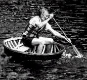
photo: Terry Kenny, coracle maker,
Newport, Shropshire
[click on the image if you are interested in reading more about
the coracle: use the Back button on your browser to return to this page,
or right-click on the link to open in a new window]
Looking back, it seems to me
now that the content of these first issues was all over the place, not
surprising, as it took a while for the style of the magazine to emerge.
For a couple of reasons, while working over the early material from
1996 - 2001, I gradually decided to edit the Coracle while converting it
for the web, rather
than stick to
a faithful archive copy.
First, the only reliable
way to archive printed material is simply to scan the original hard-copy,
without changing a thing. But as the
original magazine
is already available in hard copy, this did not seem to me to be my
top priority. Since the pages have to be formatted for the web, anyway,
and things like type size and fonts are more-or-less left to the users
discretion, some editing is unavoidable. And once any editiing is allowed,
the result is nolonger true to the original publication.
Secondly, in converting the
magazine from paper to pixels, a lot must be changed in the
layout. Apart from navigation bars at the side, top and bottom,whch
are to web pages what binding is to a book, a certain amount of padding
is inescapable in hard copy, as the magazine was designed to fit
sixteen pages per issue. This is not so in a web document, although I
happen to have kept to sixteen pages, out of habit. Some elements -
such as the publishers imprint - need to be repeated in a printed
copy, where each issue is a separate document, but a website is a
single
document, the whole volume is all here, at one time, so at least one
page in each issue is eliminated, which throws the pagination out of
whack: what to do with twelve redundant pages in each volume? Then there are
articles which are obsolete, such as twenty-year old advertisements,
that properly
ought to be cut. And once a cut has been made, the
remaining
material has to be rearranged, to avoid empty pages. As a result of
such unavoidable editings,
the web edition necessarilywinds up as a completely different document.
So now I may as well revise the material
of these early volumes completely, and feel free to republish what seems
to me to be the best of the original material, without feeling bound to
the original format, or content, in too-slavish a manner. For
instance, the original was black and white, or black on coloured cover
stock: but there is no reason not to use all the colours available on the
screen. That is one of the great pleasures of web design, a million
colours cost no more than one. Although I am not in a hurry to use all the
available colours, I intend to replace some of the black and white
graphics with the coloured drawings from which they were photocpied. Most
of the spirals in this issue, for instance, were coloured. Susan Yee
experimented with colours to see which would photocopy as black and which
would come out as white, on different machines. A lot has changed in
twenty years. When I first heard of desk-top publishing, back in 1983, I
thought, I can do that, and I went out. bought a typewriter, set it on my
desktop, and published the first issue of the Coracle. Back then, I
thought softwear was a type of undergarment.
Karen Cain once
described the
ballet dancer as someone who must dare to make all her blunders in the limelight.
Just as an experienced dancer need feel no compulsion to reproduce
faithfully all the mistakes of her apprenticeship, so
the reader may reasonably expect that the editor has learned enough by now
to
avoid republishing the mistakes of the first issue, and may be trusted to
leave in the past all that properly belongs only in the archives.
All twelve issues of volume 1
are obtainable for $30, plus postage. If you want to order copies of
the first volume, feel free to e-mail me Aidan@thecoracle.tripod.com,
or at the address posted at the foot of each webpage.
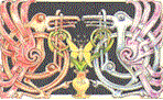
ABOUT THE COVER

The cover design , entitled, the Keeper of the Purse,
is a combination of early Celtic and medieval Irish art. The figure in the middle is the
stag-god of Gaul,
Cernunnos (so-called after an isolated inscription, apparently
related to
the latin word for deer, cervus). There is little
if any evidence
that the stag-god was called Cernunnos outside of the locality
where the
inscription was made. By whatever name he was known,
the cult of
the stag god was apparently widespread late- Roman times.
There is a famous carving from Rheims,
which show the Gaullish
god sqatting cross-legged, which is what inspired the pose
shown here.
Curiously, there is a figure from the earliest civilisation in
the Indus
valley, also horned, seated the same way. Perhaps this convention was linked to this god in very ancient times, preserved
in the
squatting god from Rheims. We see it also in an antlered figure on a panel
in the Gundestrup cauldron, also seated upright with legs bent, holding a
torc, which is the usual signature emblem of this icon. But from the
Rheims figure, it appears that he was sometimes depicted carrying a purse
filled with coins, like Mercury, the god of commerce.
The surrounding
frame is taken - anachronistically - from the
12th-century bell shrine of St Patrick, and is the late
medieval style
that resulted from the fusion of Celtic and Viking styles in
Ireland. It
is sometimes called the Urnes style, after a Scandinavian
stave church,
the door of which is framed with a woodcarved arch in similar
style. I
adapted it here to emphasise the shape of the grid, which is
designed to
look like the pre-Celtic great goddess of the late neolithic, such as the
snake godess of Crete, often depicted wearing a bell skirt, and
with arms
akimbo. The face of the goddess figure, below whom he sits, is not
indicated,
because the goddess of Nature is said to love to hide. By placing him so, I was
thinking of showning him in the role of her attendant and her son. In the
design, her hair falls like an archon either side, and changes into two
horse's heads, like the heads of the two great beasts on either side of the solar disk,
just as the keystone of the arch is a ring which replaces of the face of
the goddess.
This figure of the sun between
the two beasts is a very widespread Celtic motif - a solstice symbol, in
which two beasts devouring the sun at midwinter, and fleeing from the sun
at midsummer, the time of golden grain and horn of plenty,
which I suppose is the proper time of year for a fertility god such as
Cernunnos. As lord of livestock and harvest, he is naturally a patron of
wealth to farming people. He is shown with
a purse
overflowing, as on the stone carving from Rheims: it does seem that
the antlered god was associated with wealth, like another
guardian of the purse in classical mythology,
Plouton.
This design was
originally made for the lid of a leather purse, which is why I
selected this
aspect of the stag god, and also why the piece was titled, the
Keeper of
the purse. The lower part of the image depicts two birds
in the
coiled horns of the a dragon descending into the terrestrial
plane below:
the two sides of the dual nature of everything in this world.
The dragon
does not appear on the Bellshrine of St Patrick - there what looks like a
serpent's head was probably
intended as a
vase, or gourd, from which the spirals spring like branches of
the tree of
life, although these branches do, in fact, turn into snakes heads, so I
feel my interpretation is not out of tune with the imagery of the Irish
model. I
emphasised the
dragons head, because the great serpent is also emblematic both with the
antlered stag god of Gaul, as well as with the goddess, and, as a dragon,
is associated with gold, also. The
whole design
was conceived as an exploration of the iconography of the celtic stag god,
which as a
theme in Celtic
art is a very rich source of mythic symbolism.
Aidan Meehan,
Vancouver 2001
Contents v1.01